
1
2
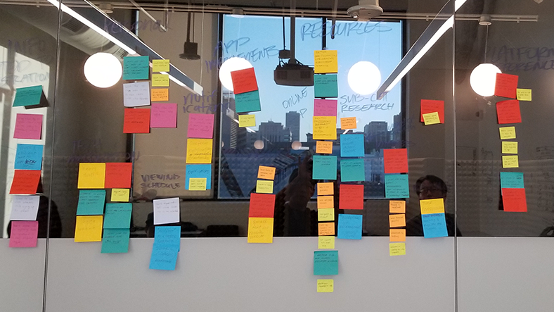
Affinity Map
The different colors represented different people. By sorting points by individual, we were able to see which topics and areas the most people had in common. This helped up prioritize topics by the number of people who expressed a point in them.
Some of these are not like the others
Although our user interviews gave great insight in the expectations and needs of our users, some major points didn't fall into any category or were so different they occupied a miscellaneous "zone" on the board.