Project Background
How do we prepare young adults for the trials and tribulations of life?
Our Brief
Create a friendly portal for young adults to engage in and learn relevant life skills.
The Platform
92% of young adults own a smartphone, so designing for a mobile lifestyle was crucial (PEW Research Center, 2016).
Team
Sophia Lee - Lead Researcher
Jacob Kim - Project Manager
Rubi Aliaga - Lead Designer
Jongho Lee - Researcher & Designer
Duration
2 weeks
The UX Journey
Discovery
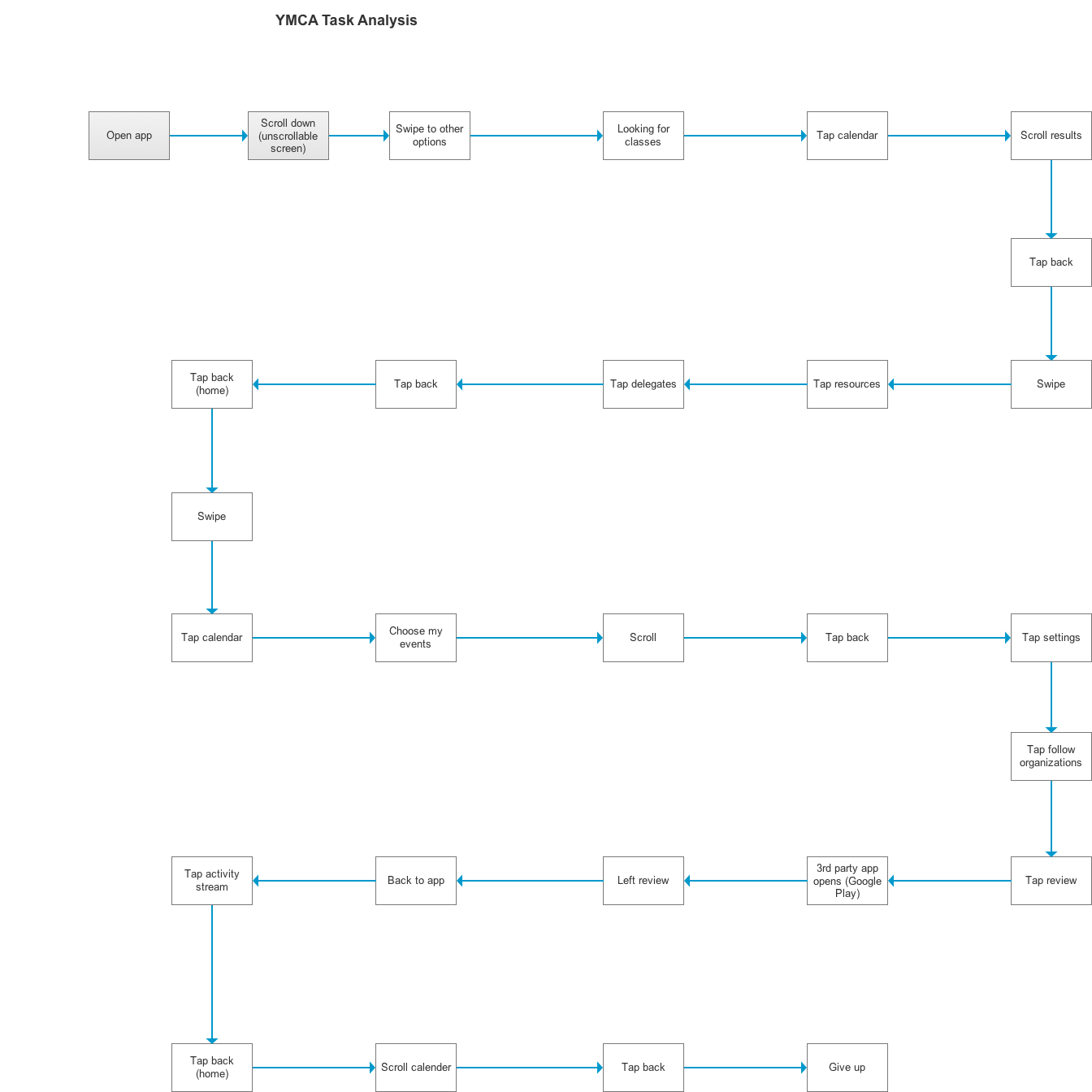
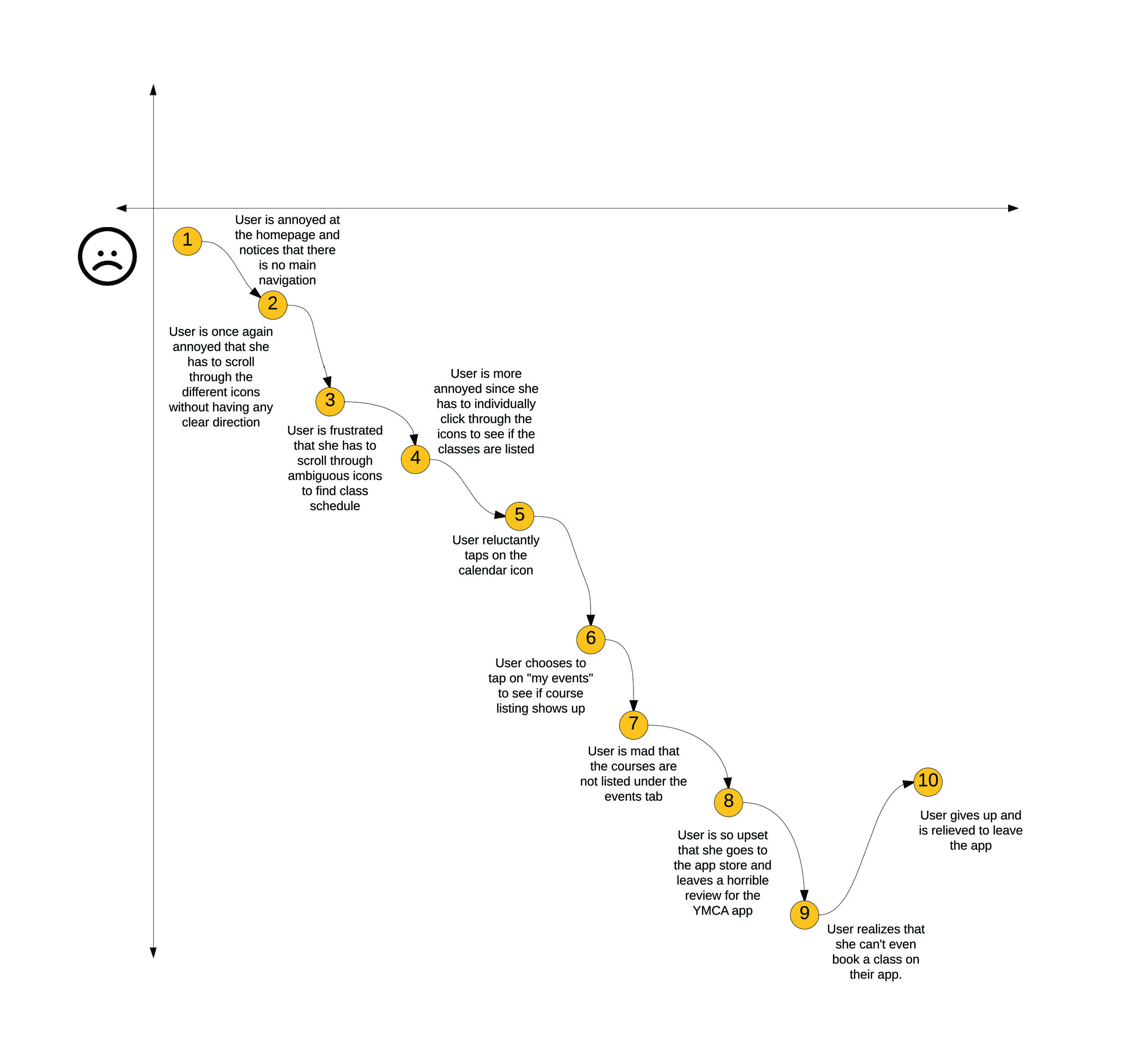
Task Analysis & Journey Map
First, our team needed to determine whether to make minor tweaks to the current design, or to redesign the app. The research results revealed that a redesign of the app was appropriate.
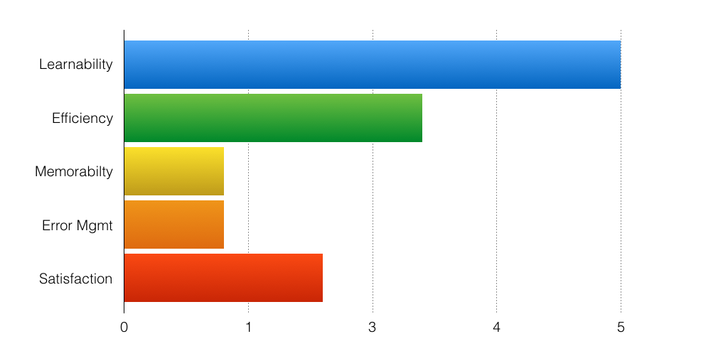
A comparison between the task analysis and journey map revealed sticky points mainly in the navigation and checkout flows. A heuristics evaluation revealed that the current app had learnability and efficiency issues, which eventually led our user to abandon her task.
C&C Analysis
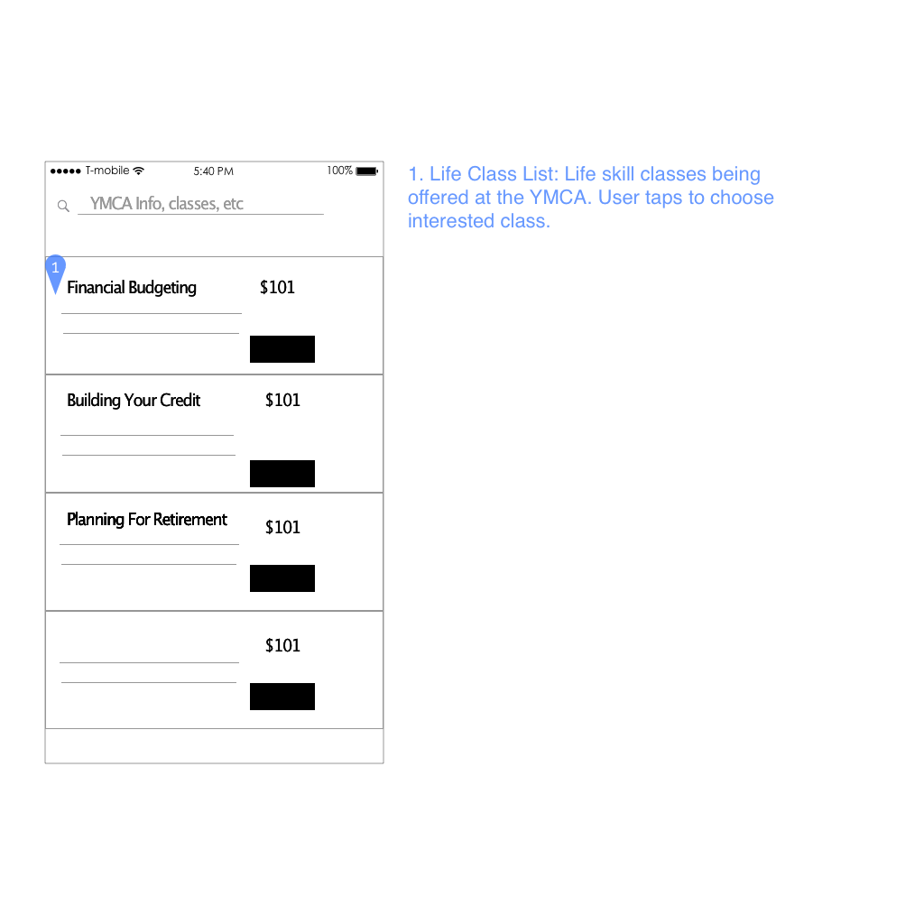
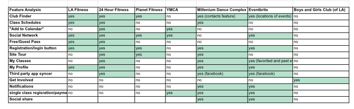
The companies we chose to compare to the YMCA in the C&C analysis either offered similar services (fitness and exercise), or portrayed a similar brand and message (community and wellness). Since the YMCA allows users to sign up for toddler play classes with the same checkout system used to sign up for group boxing classes, we wanted to expand the flow to include a life-skills classes category.
These initial research methodologies pointed out problems in the existing design and uncovered the areas that could be addressed to improve usability. But we needed the voices of our users through interviews to focus our approach to user-centered design.
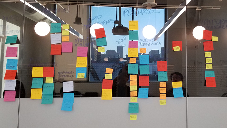

Synthesis
Armed with Post-Its and user interviews, I lead an affinity diagram exercise to group the major points by similar topics. We saw these trends in behavior, needs and pain points.
frustrations in class registration didn't start with registration, it started with the class search
knowing a friend was in the class tipped decisions into registering for it
often had several tabs open to consult different sources when signing up
word of mouth was a major method of communication (suprisingly)
anxious about the reality of adult responsibilities after graduating or leaving school
A streamlined navigation and registration process were crucial, and adding a social discovery component to the app would really encourage engagement. We knew that all pertinent information our users would need should be available to them in one platform. We also discovered a real need for the services that the YMCA was providing.
Define
Persona
Affinity mapping revealed the pain points, goals, and motivations we needed to define and refine our persona, Lily Richards
WHO SHE IS
Recent college graduate
Owns a smart phone
In need of financial advice
a current YMCA member
WHAT SHE NEEDS
Easy access to expert advice
Find friends through app
Quick registration
Explore community events

“I wish my school made it mandatory for students to take a class on how to manage their finances”
Scenario
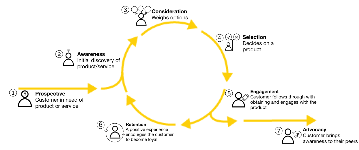
Tackling a mobile-first design had to ensure that the app would survive the 80% app deletion rate. This CRM-model scenario encompasses Lily's experience with the brand, from being a prospective customer into becoming an advocate of the brand. Lily is motivated to engage with the app beyond the first class registration.
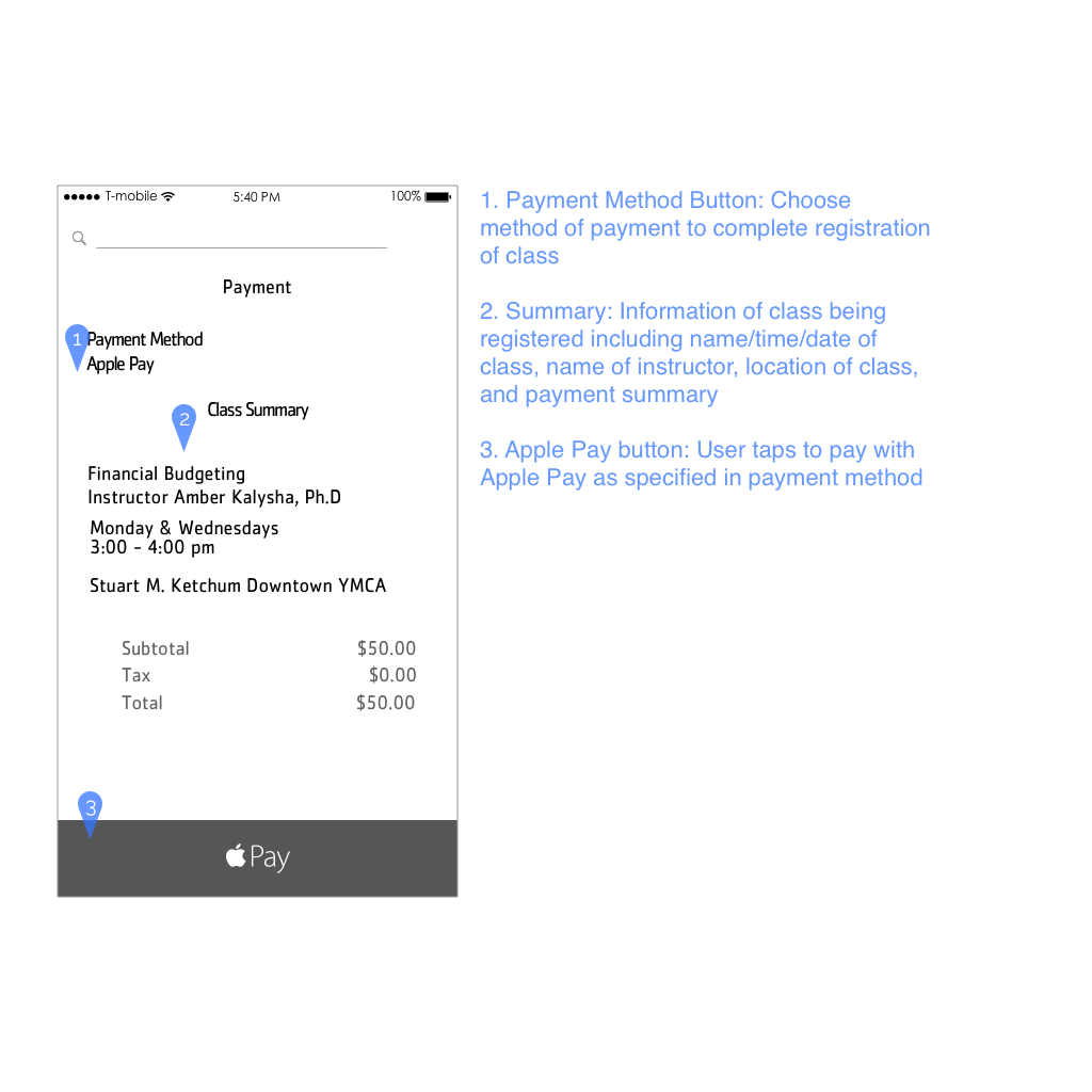
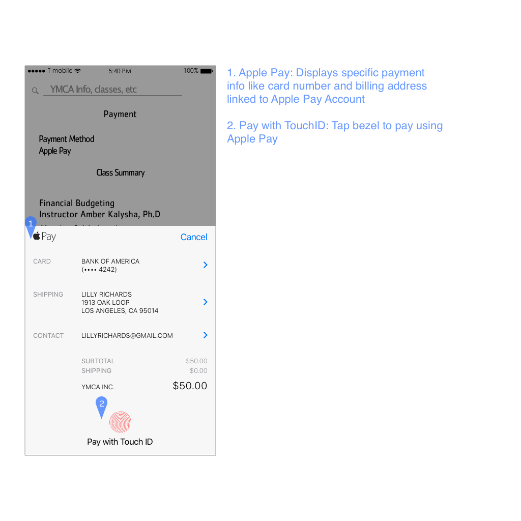
1. Prospective Lily has to start thinking about paying off her student loans but she doesn’t know how to budget for it. She is looking for a class on financial budgeting.
2. Awareness Lily’s friend Michelle tells Lily about a series of life skill classes that the YMCA has. Lily goes to the website to check it out.
3. Consideration She sees that the YMCA has the exact type of class she is looking for, and she can follow through with registering through the website or the mobile app.
4. Selection She discovers that the app has features like seeing what friends are also enrolled in the class. Lily decides she wants the app for its functions.
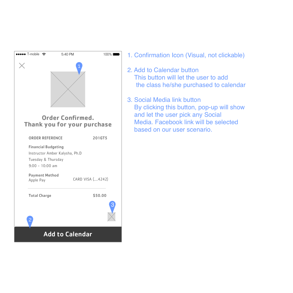
5. Engagement Lily downloads the app and goes on to register for the class she wants. She takes a moment to explore the app and see what else is offered.
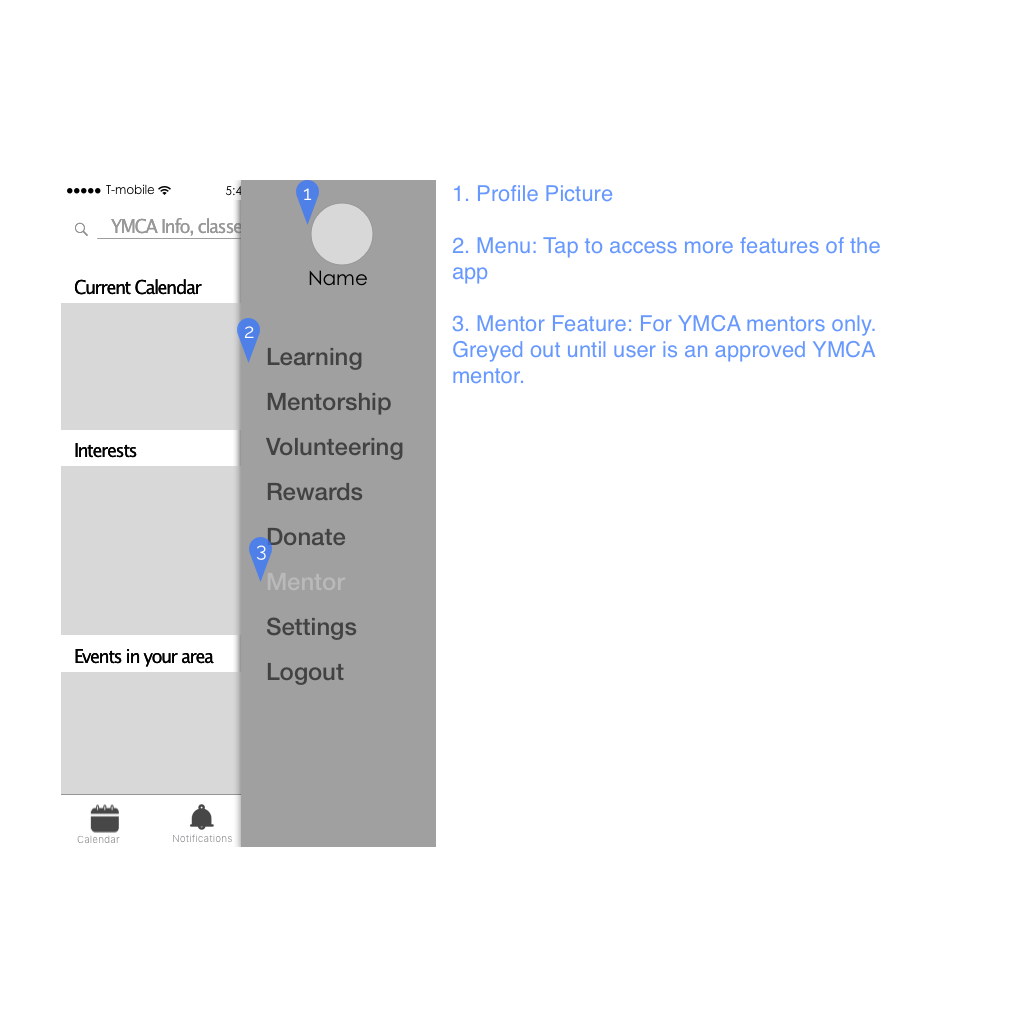
6. Retention She takes the class, and discovers that it is exactly what she needs. The YMCA also offers a rewards and mentorship program which she can access easily thorugh the app. It encourages her to keep taking classes and also engage with the app.
7. Advocacy Lily has received a lot of support through the YMCA and wants to give back. She goes on to become a mentor and be a resource to someone like her mentor was for her.
Ideate
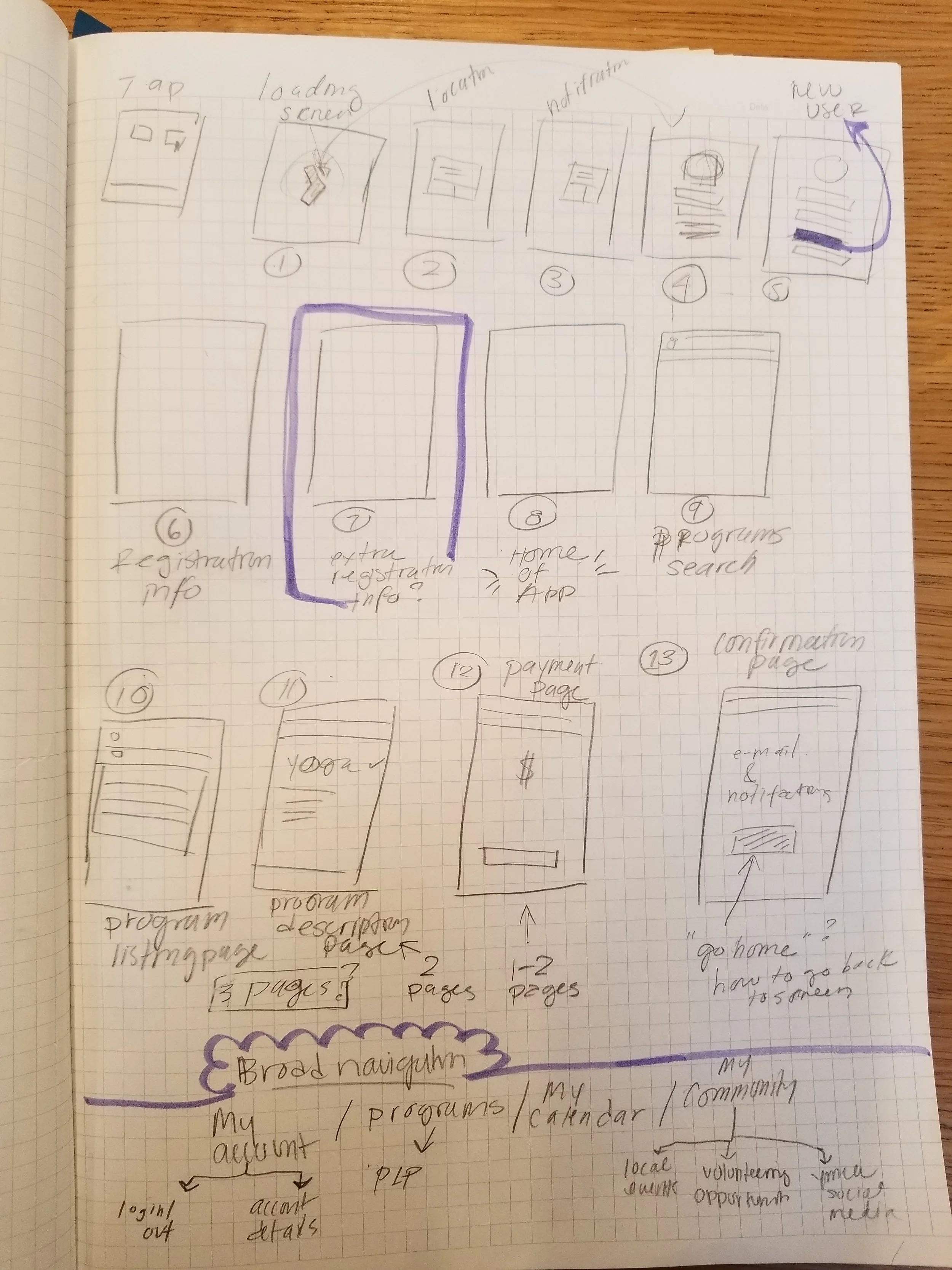
User Flow
We had our user, Lily, and we knew what her goals were. With this information, I determined a user flow starting from her downloading the app, and ending with becoming a mentor herself. Due to time constraints, we prioritized designing up to Lily communicating with her mentor people.


Information Architecture
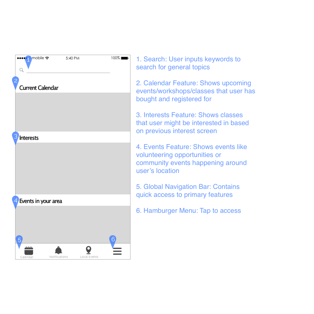
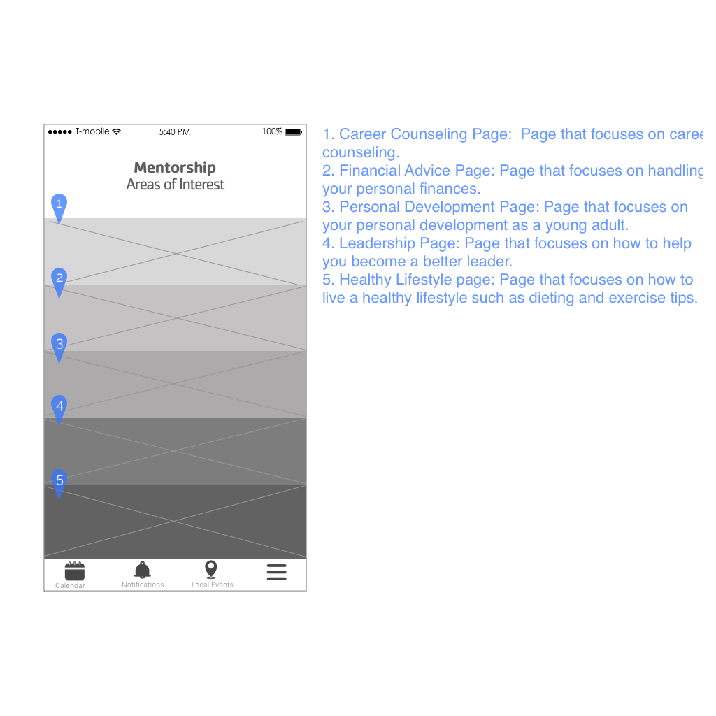
Feature prioritization informed us of which features we needed to focus, and ideation inspired features to increase app retention. Research showed that users looked for a calendar that held all their classes in one place, and we included the mentorship and reward screens that were a result of design studio. We used the MSCoW method to prioritize our "dream list" of features:
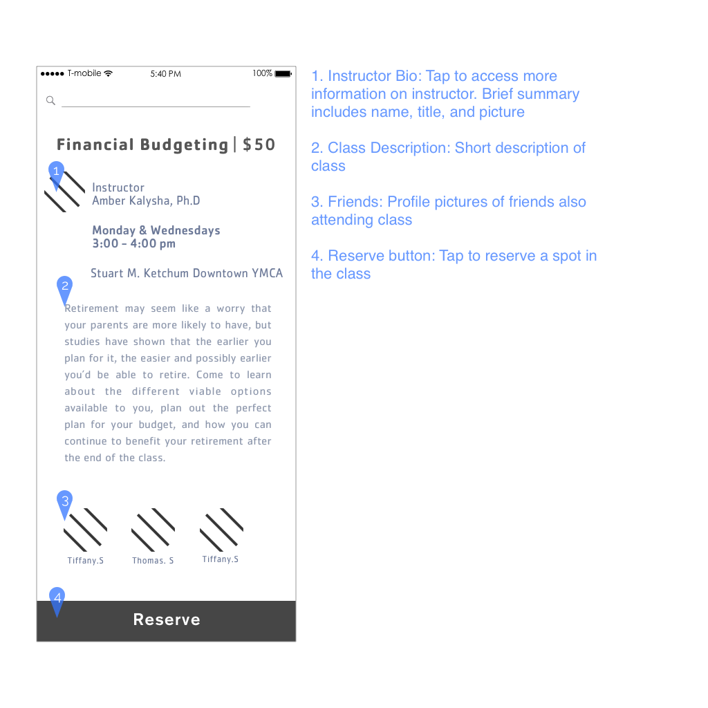
Must Have - Search class, Search locations, Class info (dates, locations), Notifications (events, upcoming classes, new classes), View calendar feature while searching for classes, My calendar, My account
Should Have - More resources (Instructor Credentials, bio), Registration for online membership, Contact Instructor, Class rating from other students based off social media, History, Social share button
Could Have - Friend icon (shows who is registered for specific class), share class registration or class schedule through text/social media
Won't Have - Social media livestream
These features structured our new proposed site map.


Design Studio
Through sessions of design studio, we solved for:
search option screen
customer retention (mentorship and rewards)
navigation schema
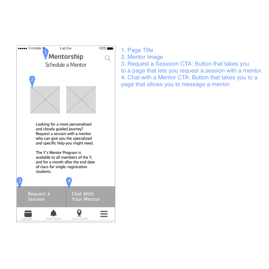
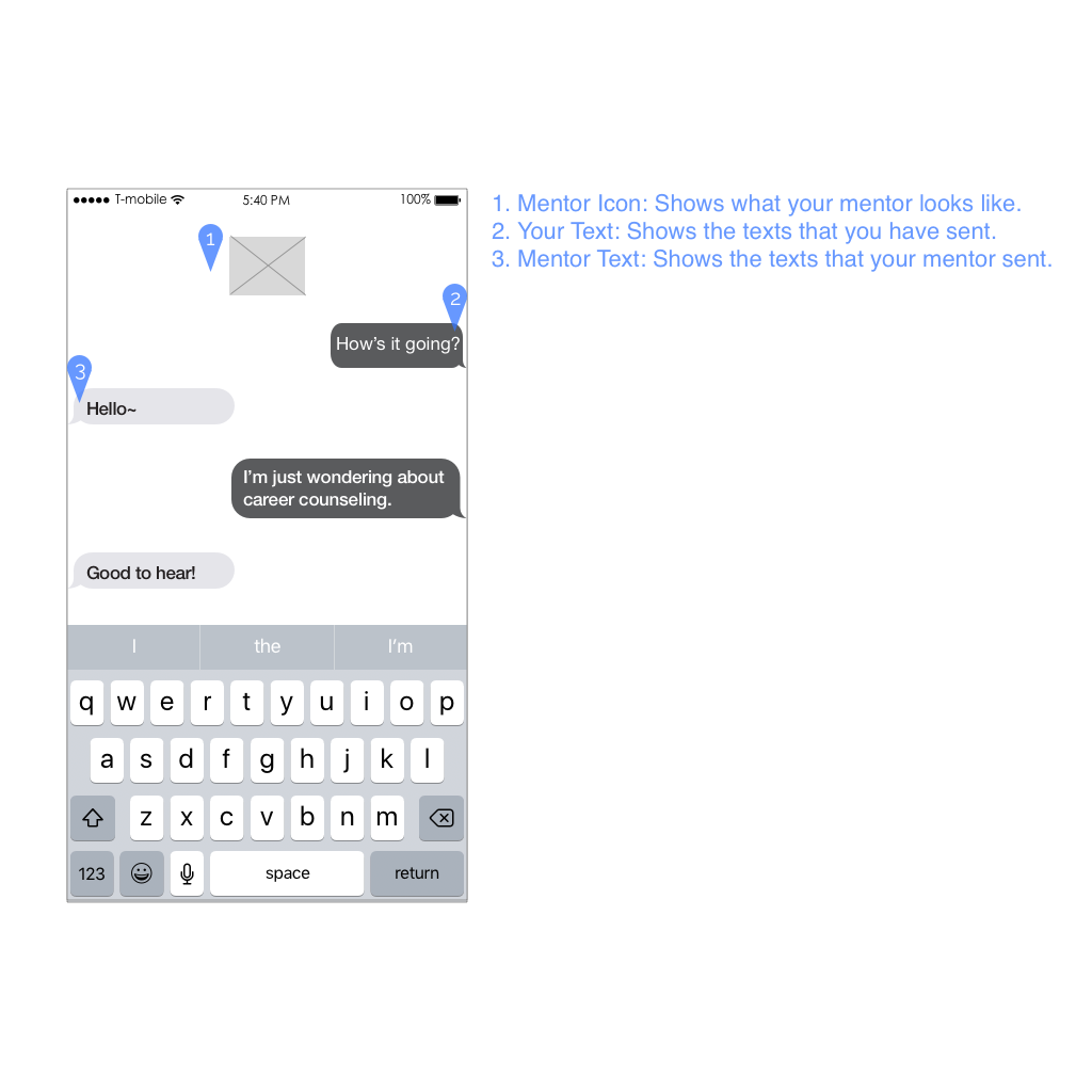
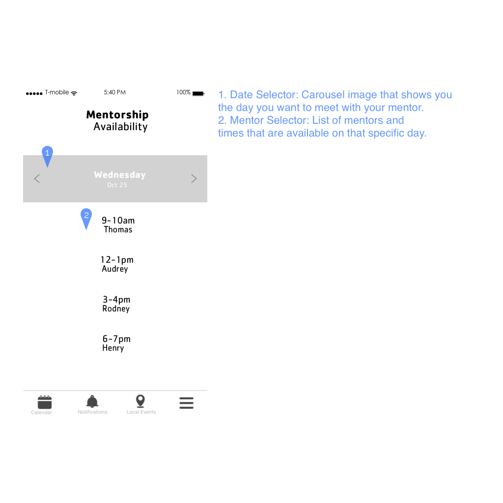
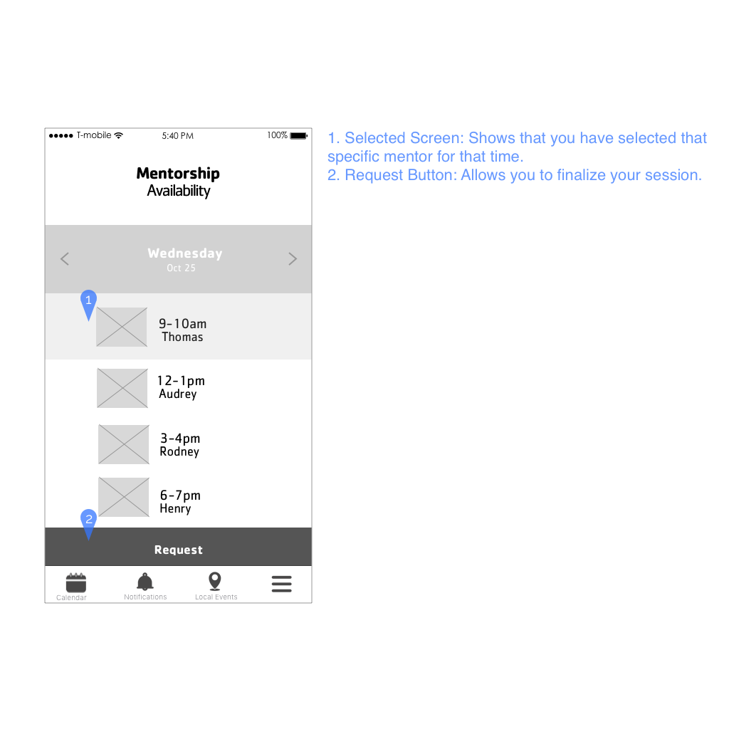
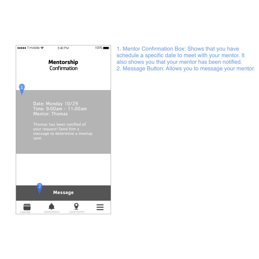
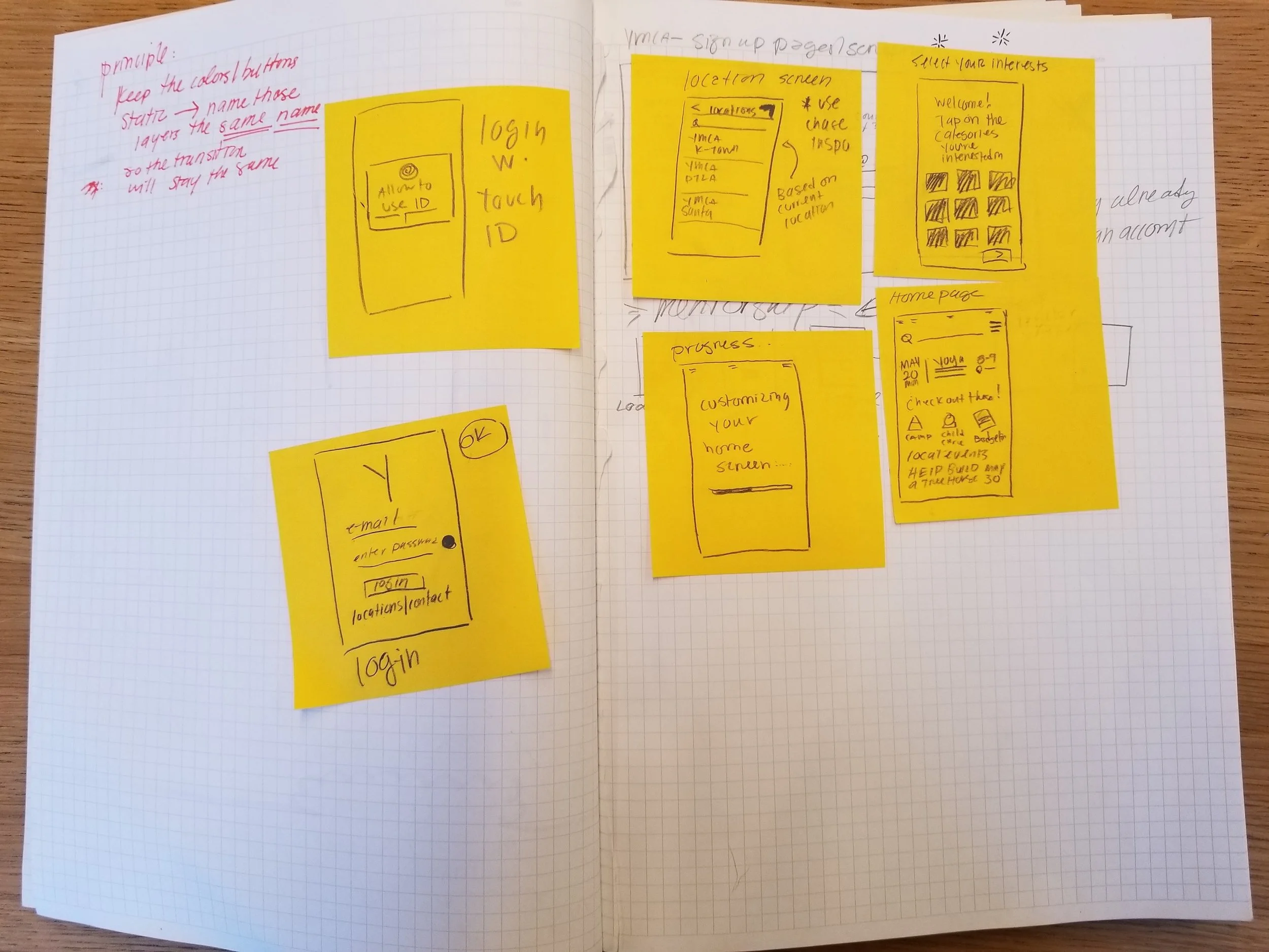
Through design studio, we decided on a scheduling feature through which Lily could request to meet with a mentor. And this feature would be available to Lily for the duration of her class and for a month after the end date.
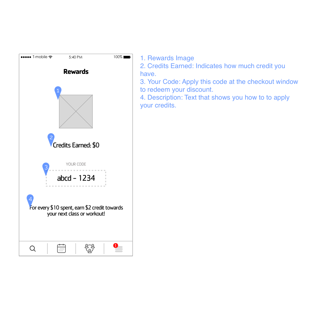
A rewards program, another retention solution, sounded great on paper, but was difficult to design for because of the abundance of reward-program models and types. After rounds of ideation, a credit-earning type seemed the most appropriate. For every $10 Lily spent on classes, she would earn a $2 credit.
Design
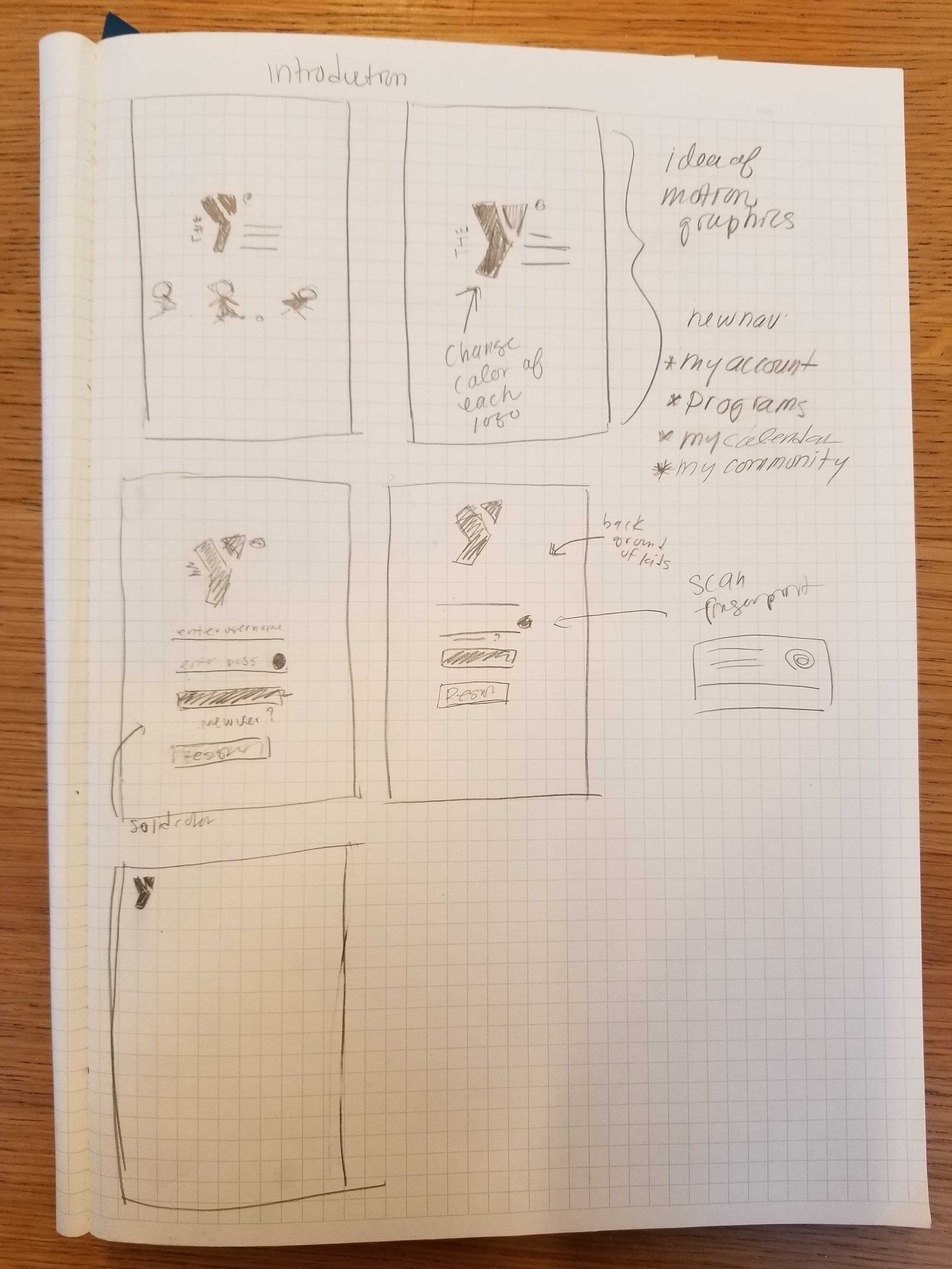
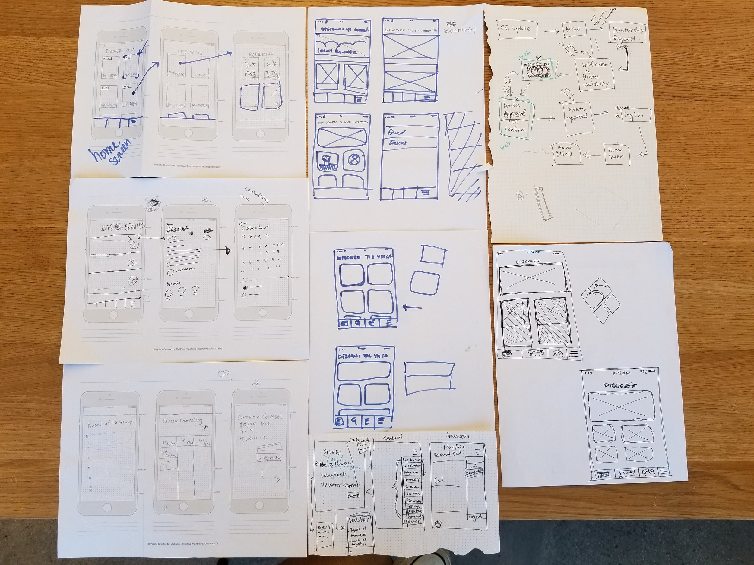
Sketched Wireframes
With a site map and user flow ready, we entered our first iteration of design
Test
Logo Testing
An idea that came up during design studio was replacing the traditional hamburger menu icon with the YMCA icon. We conducted AB testing to determine that usability of the idea. It turned out that people generally had a harder time navigating into the secondary menu with the change. This was measured by the time it took to complete the task: "find the settings feature".

User Flow Testing
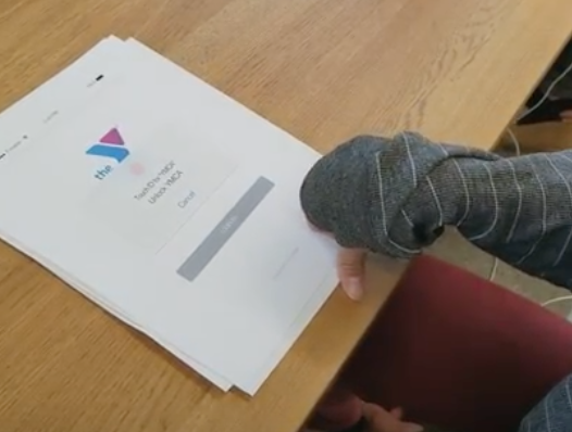
With an initial set of lo-fi key screens, we needed to validate our user flow and screen layout. A task was presented to 4 participants and they were asked to speak aloud during the test. Usability of the design was measured with time taken to complete the task, the number of errors made, and the number of positive and negative comments made.
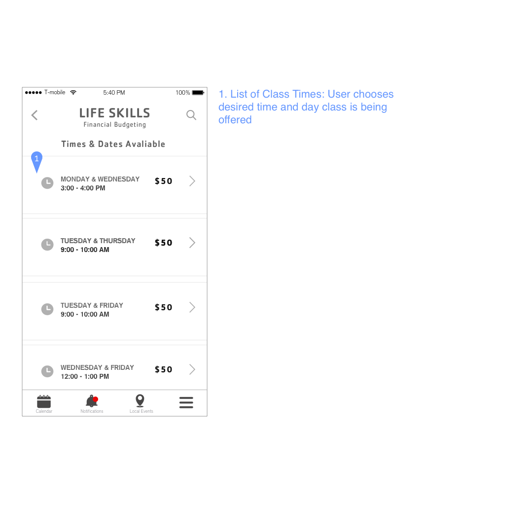
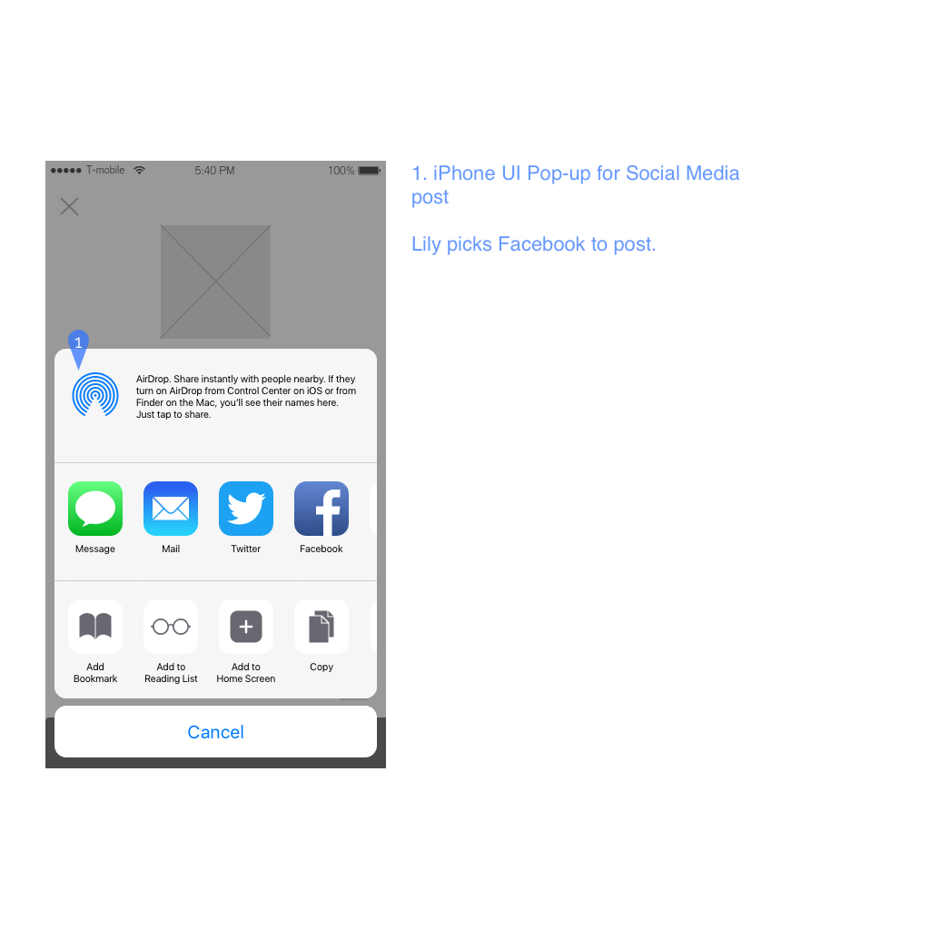
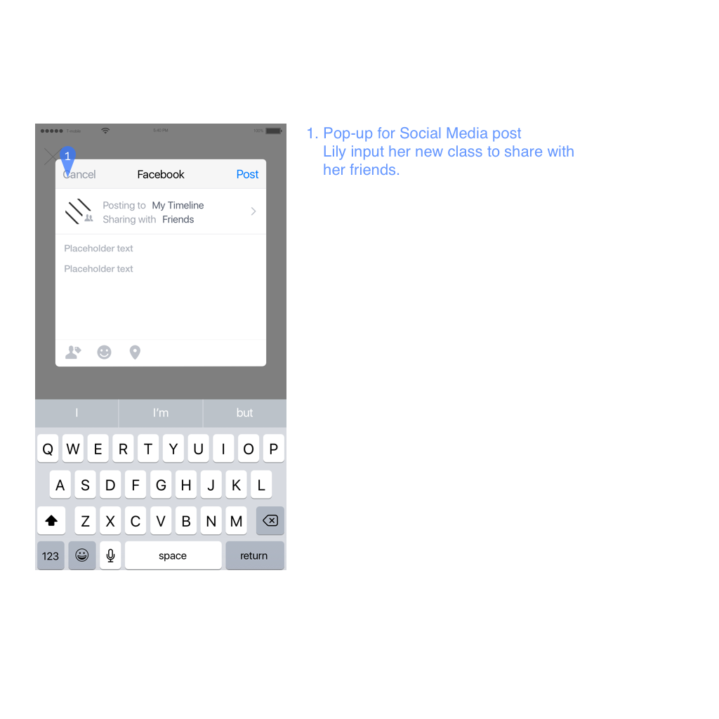
Participants took (on average) 2.5 minutes to complete the task: "find a class for financial budgeting, register for it, and share the registration on social media".

Iterate
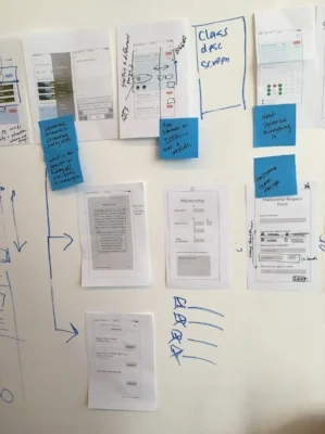
The layout of our homescreen had to be completely restructured. Through design studio, we experimented with modular layout, a search-engine-dominant layout, and material design in the form of card layout. After deciding to pursue a card layout, another design studio brought out several approaches to a card design homescreen. By bringing together the best ideas from multiple designs, we finally had a design we could bring into medium-fidelity.
Our solution
Medium-fi Wireframes